What is Data Visualization?
Data visualization techniques are essential tools for converting raw data into visual representations like graphs, charts, and dashboards. These visuals simplify complex information, making it easier to interpret and act on. Whether you’re looking at sales trends, user behavior, or operational performance, data visualization techniques help distill vast amounts of information into clear, actionable insights. They allow businesses to uncover patterns that might be missed in raw data tables and spreadsheets.
Why Data Visualization Techniques Are Crucial Today
- Help non-technical stakeholders understand complex data
- Reveal patterns, outliers, and trends quickly
- Enable faster, more confident decision-making
- Support compelling storytelling with data
- Encourage collaboration through shared visual context
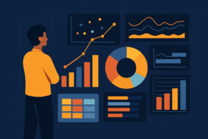
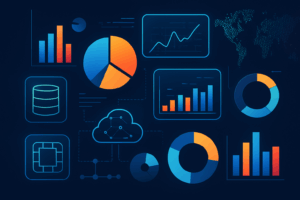
Popular Data Visualization Techniques
- Bar Charts – Compare categories with ease and clarity
- Line Charts – Show changes over time, ideal for time series data
- Pie Charts – Demonstrate proportions within a whole
- Heatmaps – Use color to indicate density or magnitude
- Scatter Plots – Reveal relationships and trends between variables
- Dashboards – Combine visuals for a unified, interactive view
Top Tools to Apply These Techniques
- Tableau – Drag-and-drop interface for fast insights and analytics
- Power BI – Deeply integrated with Microsoft tools and Excel
- Google Data Studio – Free, cloud-based, ideal for marketers
- Looker – Embedded visual analytics with governance features
- D3.js – Developer-friendly JavaScript library for custom visuals
- Excel – Still widely used for quick and simple data visualizations
How Industries Leverage Data Visualization Techniques
- Healthcare – Monitor patient trends and treatment outcomes visually
- Finance – Analyze spending, forecasting, and risk indicators
- Marketing – Measure campaign ROI and customer engagement visually
- Retail – Track product sales, inventory, and seasonal trends
- Education – Report on learning outcomes and student performance
- Public Sector – Share open data transparently with citizens
Best Practices for Implementing Data Visualization Techniques
- Start with your goal – choose visuals that fit your business objective
- Avoid overloading visuals with too much information
- Use consistent colors and chart styles across your reports
- Make all elements readable on mobile and desktop devices
- Ensure labels, legends, and scales are clearly marked
- Test for accessibility to reach a broader audience
Incorporating Visualization into Your Workflow
Embedding data visualization techniques into your everyday workflow transforms how organizations operate. With tools like Tableau and Power BI, live dashboards can auto-refresh, enabling real-time decision-making. Sales teams can visualize pipeline health, marketing teams can track campaign engagement, and leadership can monitor KPIs—all from a single source of visual truth. Embedding reports in collaboration tools like Slack or Confluence ensures insights are visible, shareable, and acted on without delay.
Further Reading for Enthusiasts
- https://www.tableau.com/learn/articles/data-visualization-best-practices
- https://clauswilke.com/dataviz/
Conclusion
As businesses grow increasingly data-driven, mastering data visualization techniques becomes a competitive necessity. From simplifying reports to supporting executive strategy, these techniques bridge the gap between information and insight. Adopting the right tools and best practices empowers teams to not only understand their data—but use it effectively to achieve their goals. The future of analytics will be increasingly visual. With artificial intelligence and machine learning producing larger data sets than ever before, only those who invest in mastering visualization will be able to convert insights into impact at scale.
Emerging Trends in Data Visualization
As technology evolves, so do data visualization techniques. One of the most significant trends is the rise of augmented analytics, where AI and machine learning assist in automatically generating insights and visuals. Additionally, real-time data visualization is becoming standard in dashboards across industries, allowing teams to react instantly to performance metrics. Storytelling dashboards—which combine narrative elements with visuals—are also gaining popularity as organizations seek to make data more engaging and digestible. Interactive visualizations, which allow users to filter, sort, and drill down into data, are now expected features in modern BI tools. These trends emphasize not just representing data, but making it actionable and immersive.